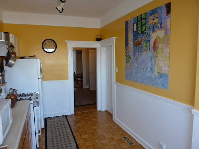
Here is what the kitchen at 17 Milton looked like when I arrived:

It is actually a fairly decent sized kitchen with an amazing view out of the large back window. The walls had been painted a bright yellow which was actually very fun (I swear there is a taqueria in the mission that is this exact color). It was not, however, the neutral color palate that would appeal to the mass number of potential home buyers.

My father had actually remolded this kitchen when he first purchased the house 15 years ago. In an effort to save money he purchased cabinets from a surplus yard, which is why the upper cabinets didn't match the base cabinets. Before I arrived, he removed the upper doors to give the look of open shelving. But instead of looking stylish, it just looked like the doors were missing. The wood finish on the base cabinets was also looking pretty beat up and conflicted with the parquet flooring.
And here is what it looked like after:

I painted the base cabinets the same glossy white as the upper cabinets. This really helped unify the two and make the parquet floors shine instead of blending in. I had my dad reattach the upper cabinet doors. They were slab doors to begin with but he cut out the center and added a frosted glass insert to give it more interest. I added brushed nickel knobs to all the cabinets to help unify the room. We also made sure that the kitchen was spotless. When showing a house it MUST be clean. What a difference, don't you think?

As you see, the bright yellow walls are gone in favor of a much more neutral off white. Now it says classic victorian instead of fun fiesta. I ordered a large seagrass runner to cover up some water spots on the floor. To fill up the space on this long wall I did some "shopping" at my parents house. I took an antique tea cart from their guest room, a silver tray from their living room, and some crystal glasses from their kitchen to set up a little mini bar. A jade lamp was borrowed from the entry, some daffodils snipped from the backyard, and a painted portrait of my great grandmother was hung above. I have always loved this painting of her kissing a little puppy. Here is a close up of the portrait:


And here is a close up of the mini bar


Notice the dishwasher in the background of this photo? It was originally black, but I removed the plastic front and spray painted it white to match the cabinets. It really helps it blend in. You can see it here in another before shot of the back door:

And after:

A mirror was hung by the back door to help reflect light and bring the outdoors in. I think this make over demonstrates the power of paint to transform a room.

No comments:
Post a Comment