Monday, October 11, 2010

Bates Nut Farm Pumpkin Patch


Yesterday I went with the family to The Bates Nut Farm Pumpkin Patch and it was amazing. I already have a love for all things pumpkin, but this was beyond my wildest expectations. Not only did they have every type of pumpkin you could think of (large or small, green or white) they also had a petting zoo, hay ride, roasted corn on the cob, and of course a nut house. I love fall!


Friday, October 8, 2010

Fall Beagles

Aren't they adorable?

{oliver & bailey}

Ok, so this picture is almost a year old (oliver is now bigger than bailey), but it is so cute I just had to post it. The ground outside my home is covered in fall leaves and its gorgeous. I think its time for a updated picture of the beagles frolicking in the leaves. Have a great weekend!

Thursday, October 7, 2010

Before & After - Guest Room

{view as you walk in from the dining room looking towards the front of the house}

{inside the room still looking towards the front of the house}
the door in the background leads to the foyer
notice the chandelier...someone went all out painting that ceiling medallion, yikes!

{inside the room looking towards the closet/door off of dining room}

This second/guest bedroom at 17 Milton is definitely what I would call tiny. The room, like the rest of the house, has a bit of a strange layout. Since there are no hallways, rooms seem to fall into one another. For example, the door to the guest bedroom opens to the dining room and the door to the master opens to the kitchen. Doesn't that seem odd? This tiny bedroom actually has two entrances, one right off the dining room and the other off the foyer. Why a small bedroom needs two entrances - I have no idea.

Aside from the odd layout, you can see the carpet had been torn out when I arrived (to fix a slope in the floor) and the room was currently being used as a work/storage room for odd furniture and tools. It was the perfect before shot because it looked like a disaster. Now for the after...

First the wall were painted off-white. They were a baby blue before which made the room feel juvenile and cold. New neutral carpet was installed. A free mattress from craigslist was picked up. My dad said it looked like the mattress that typhoid mary died on and I have to admit it looked pretty gross. I could have cared less, since it was for show only and once it was covered with bedding no one would know the difference. I made the headboard using plywood, foam, heavy linen and my trusty staple gun. Easiest headboard ever!

The nightstands were two small bathroom cabinets I had purchased from target years ago and no longer needed. They were originally a cherry wood,so I painted them black and added new hardware to give it a new look. I love these antique brass lamps from my grandmother. Topped with some small black shades from target, they were the the perfect scale for the nightstands. A framed painting was hung over the bed.

Aren't these orchids gorgeous? They are from my mothers garden. She is amazing.

I tried to create a little seating nook beside the window next to the closet. And yes this window looks directly into the master bedroom, another awkward layout problem. I placed a small needlepoint bench under the window, hung long white curtain panels from ikea, and placed a pair of decorative sconces on either side of the alcove. It created a really sweet vignette (I wish I had better pictures). I would have preferred a small dresser, but since we didn't have one on hand the bench was a sweet alternative.


Wednesday, October 6, 2010

Master Bedroom - Before & After

Welcome to 17 Milton's master bedroom! It doesn't exactly feel like a master bedroom, does it? Maybe thats because there isn't a bed?

Ok, so the fact that it didn't have a bed was a big problem, but it wasn't the only problem. Where to start...lets talk about the wall color. While the dark brown walls could have been incredibly chic in the right room, it definitely made this room feel smaller. Of course you don't want a room to feel small when you are trying to sell a house. The room also had a terrible ceiling fixture (which you can see a bit of in the picture below).


The hodge-podge of furniture in the room had to go. And look how sad those curtains are. They are about two feet too short and one panel per window just wasn't cutting it.

The door to the master bedroom is right off of the kitchen. You can see the original bright yellow wall color in the background. This master bedroom wasn't huge, but it had some things going for it. I loved the neutral diamond relief carpet. It had two good sized windows which let in a lot of light, that made the room bright and airy. It also had tall ceilings perfect for a chandelier (i love putting chandeliers in bedrooms).

Here is the after:
{view as you walk in the door}

After removing all the random furniture in the room, I painted the walls a neutral off-white. The room instantly felt larger. I removed the hideous chandelier that was originally there and hung a new chandelier, which I found at a salvage yard. It was a bare bulbed brass fixture when I found it. I wish that I had a before picture, but hopefully you can imagine. Here is a close up of it after.
The white spray paint made a huge difference and some black shades from lamps plus finished off the mini makeover.

Here is a close up of the bed. I used all white bedding. For bedside tables I used some small end tables my mom had around her house. They weren't identical, but had the same scale. Both had previously been painted dark brown, but after years of use they were in need of a makeover. I painted them glossy black. The pineapple lamps are from my house. They were actually walmart lamps which I spray painted white. Some pretty books and small flower arrangements finished off the nightstands. A framed painting was hung above the bed. The short burgundy drapes were replaced with long white panels from ikea.


On the opposite wall we set up a desk/vanity area. The desk is another item pillaged from my parents garage. It actually used to be my brothers when he was little. I bought the federal mirror from the same salvage yard as the chandelier and painted it black. The bamboo chair was from my house (I think this was originally a salvation army purchase). The gorgeous marble lamp was borrowed from my parents living room.


I'm sorry that this close up is so blurry. The orchids really were beautiful (from my mothers yard). A little silver footed bowl, a small shell dish and a jewelry box topped the desk. I would have preferred to put a long dresser on this wall since it had the room, but there was no money in the budget for it and nothing I could take from the rents that wasn't awfully heavy and antique. Since we didn't want to pay for professional movers or run the risk of damaging the piece in the move, I settled for the desk. Not a bad second option.

Tuesday, October 5, 2010

Kitchen - Before & After

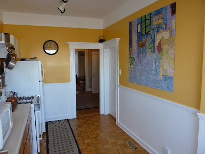
Here is what the kitchen at 17 Milton looked like when I arrived:


It is actually a fairly decent sized kitchen with an amazing view out of the large back window. The walls had been painted a bright yellow which was actually very fun (I swear there is a taqueria in the mission that is this exact color). It was not, however, the neutral color palate that would appeal to the mass number of potential home buyers.


My father had actually remolded this kitchen when he first purchased the house 15 years ago. In an effort to save money he purchased cabinets from a surplus yard, which is why the upper cabinets didn't match the base cabinets. Before I arrived, he removed the upper doors to give the look of open shelving. But instead of looking stylish, it just looked like the doors were missing. The wood finish on the base cabinets was also looking pretty beat up and conflicted with the parquet flooring.

And here is what it looked like after:

I painted the base cabinets the same glossy white as the upper cabinets. This really helped unify the two and make the parquet floors shine instead of blending in. I had my dad reattach the upper cabinet doors. They were slab doors to begin with but he cut out the center and added a frosted glass insert to give it more interest. I added brushed nickel knobs to all the cabinets to help unify the room. We also made sure that the kitchen was spotless. When showing a house it MUST be clean. What a difference, don't you think?

As you see, the bright yellow walls are gone in favor of a much more neutral off white. Now it says classic victorian instead of fun fiesta. I ordered a large seagrass runner to cover up some water spots on the floor. To fill up the space on this long wall I did some "shopping" at my parents house. I took an antique tea cart from their guest room, a silver tray from their living room, and some crystal glasses from their kitchen to set up a little mini bar. A jade lamp was borrowed from the entry, some daffodils snipped from the backyard, and a painted portrait of my great grandmother was hung above. I have always loved this painting of her kissing a little puppy. Here is a close up of the portrait:


And here is a close up of the mini bar

Notice the dishwasher in the background of this photo? It was originally black, but I removed the plastic front and spray painted it white to match the cabinets. It really helps it blend in. You can see it here in another before shot of the back door:
And after:

A mirror was hung by the back door to help reflect light and bring the outdoors in. I think this make over demonstrates the power of paint to transform a room.

Monday, October 4, 2010

Dining Room

Here is the dinning room before:

The display cabinet was taken out of the dining room and lower half was painted black and used as a buffet in the living room. The "gorgeous" area rug left by the previous tenant also had to go.

The dining table had been pushed to one side of the room to make an easy pathway to the kitchen, but this made the room feel more like a hallway and less a formal dining area. You can also see that the large windows have a up close and personal view of the house right next door. You can open the window and touch the neighbors siding.

While there were some major defects with this room, it did have a few things going for it. It had an amazing coffered ceiling, a beautiful grapevine chandelier, and hardwood floors. Unfortunately none of these things seemed to stand out, because there was so much furniture in the room.


Here is the dining room after:


I wish that I had more after pictures, but this pretty much sums it up. The walls were left the original neutral and the ceiling stayed grey-green which highlighted the trim work and related nicely to the green sofas in the living room. The table was centered in the room and the chandelier lowered to help make the dining room feel more formal. I also painted the chandelier white and added black shades to tie it into the chandelier I hung in the living room. I kept the original table, but removed the lace table cloth and shined it up with some furniture polish. The bamboo chairs were a cheap purchase from craigslist. They were already painted white (which was perfect) but had a terrible plam leaf motif fabric on the seats that was straight from the "golden girls" lanai. I recovered them in solid black. The windows already had some sheer panels hung over them, but I swapped the single curtain rod for a double rod and added a second layer of white drapes from ikea in a thicker material. This way the sheers could stay closed to hide the neighbors siding while still letting light in, while the thicker panels add more weight making the window treatments feel more expensive. I would have loved to use a bamboo shade in place of the sheers, but was afraid it would block out what little sunlight this room gets. Not to mention it would cost more money and its hard to compete with something that is free. I also flanked the door to the kitchen with framed convex mirrors from Aaron Brothers. They are so classic, I could use them in every room I design.


Monday, September 27, 2010

The Living Room - Before & After

Here is what the living room looked like when I arrived. My parents had already painted the living room walls a neutral off white, but the ceiling was still painted a dark taupe (something the previous tenant had done). While the chandelier was an impressive gothic fixture, it looked like something that was more fitting for a castle than a cottage. The tenant had also left behind the green sectional you see in the picture, the coffee table, some end tables and the rug. My parents had brought in some accessories and extra seating to make the living room feel less sparse.

Here is the after...
We painted the ceiling white and replaced the gothic fixture with a tole-like chandelier. I actually found this light in the dumpster of my apartment complex (much to the horror of my husband). It was a dirty off white, but I saw potential. I am a big believer in the power of paint and I was sure that with a few coats of glossy white spray paint it would have a new lease on life. I didn't know where to use it at the time, but when I came up to san francisco to view the house I knew that it would perfect for milton street. The chandelier in the dining room (which you will see in another post) is covered with ornate grapevines which I thought would relate well to the ivy leaves on my rescused chandelier.

Since the green sectional was in decent shape and it was free, we decided to keep it and add a few throw pillows. The coffee table was purchased on craigslist for $20. It had a faux finish on it that looked like a copper patina. My brother spray painted it black (thanks Robert!) and once again the power of paint worked its magic. The floor lamps we borrowed from my parents house. The architectural prints came from a book I purchased many years ago called "Andrea Palladio: The four books of Architecture." I cut out 15 prints and framed them in literally the cheapest frames I could find. I believe I purchased these at walmart for $1 each. Here is another before shot of the room (from the dining room looking towards the front of the house).

And here is the after...

I ordered the seagrass rug online for $99. We reused the existing curtain rod, but painted it from silver to flat black. The curtains are from ikea. The little table in the corner was borrowed from my parents home. Here is another before shot taken from the bay windows at the front of the house looking towards the dining room. Notice the display wood display cabinet in the dining room...

Here is the after...


I know it is a slightly different angle that doesn't give you as wide of a view into the dining room, but I think you get the idea. First we removed the small table and two chairs. Now remember that display cabinet from the last photo. It was part of a dining set that my parents purchased from a friend. We removed the glass top and my mother and I painted the lower half a high gloss black. We replaced the wooden knobs with some inexpensive antique brass pulls and knobs from lowes. The mirror, frames, and orchid was borrowed from my parents house. The pair of blanc de chine lamps I purchased from one of my favorite consignment stores for $70. Yes thats right $70 for both. Can you believe it? It was such a steal that I actually felt a little guilty upon leaving the store. Of course that didn't stop me from running to my car and speeding off like a nascar driver, just in case they realized they had just made a mistake. Those lamps now sit in my office and i love them a little more each day.

This was definately a design on a dime design project. By the time I arrived, so much time and money had been spent on the important things like repairs to the foundation, bringing the electrical and plumbing up to code, and a new roof, that the staging budget was looking pretty sad. But good design isn't always about spending a lot of money. Good design is about being imaginative and creative. Having a small budget or no budget at all forces you to be creative by making think outside the box and sometimes these are the projects I am most proud of.